Animal Print is a Neutral

Animal print is a neutral.  I’ve heard this a lot lately, and I think it’s so funny!  But true!  Jenna Lyons at J. Crew is really the one who has made leopard a mainstay in all of our wardrobes.  That trend has carried into interior design.  Be careful though, it can start looking cheap really quick!  Don’t be afraid to use animal prints with bright colors and other patterns.

January February 2013 Issue - A leopard-print ottoman and wooden occasional chairs surrounding a white mantel

Lonny Magazine Designer Jessika Goranson
leopard chairs and yellow drapes
MMR Interiors
Beautiful beige living room with leopard pillows
Unknown
Sally Wheat Interiors, entry, leopard stools
Sally Wheat Interiors
leopard print chair with nailhead + coral pillow
Suellen Gregory Interior Design
Leopard chair.
Unknown
a little leopard.
Unknown
This look can be so sophisticated or really cheapy!  It’s tough to pull off, but when done right it’s so chic!
sjn

Up, Up, Up

Sometimes the staircase in a home is overlooked, but I think that’s a mistake.  It’s a huge architectural feature in your home, and it can really make a statement.  Here are a few I really like.

source unkown

I LOVE this railing.  It’s dainty and strong at the same time.  It’s modern and a little French (which I always love).  So sophisticated.

James Hunniford-designer.  Another iron staircase.  These metal staircases are my obsession right now.  I love the thin lines they create.  And the gold railing on this one, makes it so rich.

Liz Hands Wood- designer. This look is definitely sophisticated but the grass runner gives it a great California casual feel.
127
Fairfax & Sammons Architecture.  The spindles on this staircase are very straight and thin, almost streamline.  This house is so traditional and like this simpleness with everything else going on.
Kathryn Scott Design.  The stairs are marble.  This is very formal but really makes it French.
This one is so different.  It’s a tudor style house.  The baluster is very traditional in design, but they whole thing feels up to date with the are and white paint.
Peter Dunham Design.  This is your standard traditional railing.  Dunham has updated this look with the great pattern.  And the white paneling looks great.
Loi Thai Design.  They kept the original balusters and painted everything white.  Looks so beautiful with the light floors.
Mary McDonald Design.  This is a wonderful combination of so many great design techniques.  Again, a traditional staircase, but she’s added a beautiful tile pattern, gorgeous wallpaper, grass runner to soften things up, and a brass lantern for more shine.
This look is so beachy and soft.  The balusters have lovely rounded tops.  So cute!
VT Interiors.  Beautiful custom details on this railing.  It’s specifically designed for this home, giving it a modern, casual feel.  Love it with the traditional paneling.
This staircase totally gives character to this space.  It reminds me of an updated chalet!
Black railing.  I almost did this to our current house. I’m so glad I didn’t!  I still like it, but it wouldn’t have worked in our home.
So many to choose from!  Do you have a favorite?

Changes to the Blog

Hi friends!  Hope you’re having a happy summer!  It’s getting extremely hot here in Oklahoma.  So we are swimming a lot and generally having a great time with friends and family.

Change is a part of life, right?  Well, without being aware of it, this blog has changed.  In a good way, I hope!  I’m pretty much finished with the major remodel projects around my house.  I’m still working clients’ homes (which is my love).  The more I work on other projects, the more I come to understand all of the nuances of design. A few years back, I was a teacher.  I come from a family of teachers, so naturally I want to teach and explain why I design the way I do.  I even like to explain other great designers rooms.  I like to dissect rooms to understand why it makes you feel a certain way.  Design, is feeling and function to me.  Every little detail contributes to the overall look of a room.

This blog has been a blessing in my life. I wouldn’t have a design business without it.  I think it makes people feel comfortable with me.  They know what to expect when they ask me to help them in their homes.  In future posts, I will keep doing what I’ve been doing lately: posting pictures and explaining what makes each room is so special.  I might also throw my opinion in about certain styles.  There’s not really a style of design that I don’t like.  Just as every personality is different, so should every home be different.  Your home is a refection of you!

So I will leave you with something that inspires me today. I’m obsessed with wallpaper. You have to have a bold personality for many wallpapers.  This is one I’ve been dreaming about for months.  I love this because it could go so many directions: bohemian, formal, or even nursery.

Hope you all have a great weekend!


To Faux or not to Faux?

T0 Faux or not to Faux?  That is the question.  At least around these parts.  I would say for the last 10 years the Old World style has been very popular in Oklahoma.  Things are changing a bit lately.  Things are becoming a bit brighter and cleaner.

I have a philosophy when it comes to this style.  I really like it if it’s done right.  Some people tend to go way over the top (as in anything in life, right?).  The key to successfully decorating in this style is moderation.  Too much fringe.  Too much gold.  Too much velvet.  Too many faux painted walls.  This has such a heavy feeling to me.  However, I think Old World can be done with out going to the extreme!

My Old World Rules:

Rule #1- Never faux finish or crackle paint an entire kitchen or bathroom.  Instead, do just one piece of furniture.  I think this makes it look more authentic.  People wonder: Is that really old?  But if the entire kitchen is done that way, it’s pretty obvious it’s not really antique.

Here are some examples of this I really like.

Now this Swedish armoire is probably really old, but you get the idea.  The patina of the piece also goes with the rest of the rustic furniture.
This living room is bright and beautiful.  The antiqued mirror adds character to the room.
Design by Lisa Luby Ryan.  Notice the chest, mirror and settee all have a patina.  These few pieces add that Old World charm without being over the top!
Rule #2- Never faux finish the walls of an entire room.  Of course, there are exceptions to this rule.  If you have a professional that knows how to create a beautiful patina to woodwork, it can be extremely beautiful!  I’m really talking about what they used to do here in Oklahoma about 5 to 10 years ago.  They would paint the walls then take a rag and rub a stain or another paint over the top.  I think the goal was to create a cool finish.  Some did look okay, but a lot of the finishes just made the walls look dirty.  I think you can still achieve the old look without this effect.
Another design by Lisa Luby Ryan.  This room still has an old French/Belgian feel because of the furniture, art and lighting.  Nothing needs to be done to the walls to give this effect.
This home is by Loren Interiors in Houston.  It has a distinctly European feel because of the rock, wide plank floors, furniture and lighting.
Decor de Provence.  Notice old-looking floors, old fireplace, art and beams.
I think this room is so homey and beautiful.  The beams add richness and I love the painted bookcases.  They might even have a patina finish on them that would be a great little touch.  The smooth cream walls keep it so soft.
This has a more rich look without being over the top.  It’s still livable.
Rule #3- Keep fabric and trims to a minimum.  I would say the majority of us do not live in a palace like Versailles, so why do we try so hard to make our homes look like a castle?  Everyone has their own taste.  I understand that.  For me, I like to keep the opulent finishes to a minimum.  I love a very formal look, but I’m talking about embellishments.
Reece Witherspoons ranch in California.  It is very Old World Spanish without fringe and red velvet.
The iron staircase and luxurious rug add the richness to this space.
Room by Patricia Healing and Daniel Barsanti.  It’s Old World in architecture, but the furniture is simple with luxurious upholstery.
These homes are really Mediterranean in origin.  And who doesn’t love the Mediterranean? It’s glamorous and rich looking. I think that’s why people around here want to try to copy that European look.  In moderation with a few great pieces, it can be extremely lovely and luxurious.


Keeping Focused

Sometimes I feel like half my job is keeping a client focused on the ultimate goal.  It’s so easy to get distracted by all of the beautiful things out there in the design world.  And there are so many aspects to design that you must consider.  Sometimes you just want to do the easy thing: It’s easy to become enamored by some shiny object.  It’s easy to get wrapped up in the functionality of something and loose sight of the beauty.  It’s easy to be overwhelmed by the cost of things.  It’s easy to desire whatever your BFF or neighbor has in her house.

Here is what I say to that:  State a goal at the beginning of the project.  For example, my favorite colors are red and green.  We do not live a formal lifestyle: therefore, the rooms need to feel cozy and livable.  I like Asian inspired pieces and big compfy furniture.  The hardware in my whole house is a dark brass. Decide whether you’re going to use white or cream (I’ll talk about this later). Come up with a budget.

Work with a friend or decorator.  Someone who can have an objective opinion.  Someone who will tell you the truth.  Someone who keeps on or ahead of trends.  And really your decorator should be a friend.  Someone you love working with and bouncing ideas off of.

You want your house to look and (key word: feel) cohesive.  It should flow nicely from one end to the other and from top to bottom. Your master bath shouldn’t be French country and your kitchen midcentury modern.  It’s confusing and unsettling.  The feel part of design is equally important as the practicality.  Every piece you put in that space should contribute to the overall look.  If one piece is out of sync, it throws everything off.  That piece stands out.  Basically, it can ruin all of your hard work.  No good!

Here are some rooms in which I think the designer did a great time incorporating functionality and staying on track with the design look and feel.  I’ll explain why as we go.  I love breaking things down!

Let’s look at this bedroom first.  It is neutral, but there’s so much more going on to make it feel three dimensional.  The cream curtains frame each window. They add softness and elegance.  The headboard is upholstered with a stripe, that adds softness and pattern.  There’s a chair in velvet that adds luxury.  The floral pattern rug breaks up the space in a whimsical way.  The metal furniture add shine and a hard quality that breaks up all of the softness in the room.  The light adds that contemporary touch to the room.  None of the pieces are a set.  This gives it that collected, expensive, designer look.

Let’s look at this kitchen.  They stuck to feel on this kitchen without sacrificing practicality.  This wood looks so rich with the white molding.  The tile creates a beautiful pattern. It has that hand created look that adds softness.  The tiles are not perfect.  Looks like maybe they did caesar stone or marble on the counter.  They did that because of all the pattern with the tile.  You can’t have pattern (like with a granite) on the countertop and pattern on the backsplash too. Everything from the pulls to the faucet to the beaded glass adds to this look.  Even what’s in the cabinets gives it a more modern but homey feel.  FEEL is so important!
Now let’s look at a mast bathroom. This is perfection in design.  She placed her pattern on the floor.  Therefore, the windows and walls had to be solid.  You really have to pick one or the other.  This light blends, but it also is the right color and size.  The art is just the right color and size for the space.  Every little detail makes this room feel peaceful and luxurious.
Let’s look at dining room.  I would say the two big things in a dining room are lighting and variation of furniture.  Both of these things add depth.  Lighting is HUGE to me.  It can change the feel of a room.  Look past the finishes in this room and look at each individual piece.  You might have thought: Red curtains?  Ugh.  Bookcases in the dining room?  Weird.  Frosty chandelier?  What.  Patterned floors and chairs?  Crazy.  But it works!  It’s so interesting.  Every detail makes a difference.
I  love breaking things down.  It helps me as a designer to go back and look at these things.  Gives me new passion to stay on track. It’s okay if your vision doesn’t come to live in a year or even two.  Keep focused, save your money.  Gradually buy those pieces that work in your home and are a reflection of your personality and how you want your home to feel.  Don’t buy anything just because you feel like time is of the essence.  Make sure it fits into the grand scheme and look of your entire house.

A Little Rustic

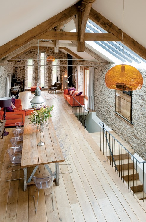
I love where some designers are going with the rustic look these days.  Sometimes I think rustic can be kitschy and dark.  While I don’t mind an animal head mount every now and then (I have a few in my own home, thanks to the hubby), this look can look very manly and rough. But I feel there is a new wave of rustic. Many of the designs have beautiful exposed beams and lighter walls.  The neutral grays and tans are really lovely.  Here are some pictures that I find soften the look.  It looks more livable and bright than ever before.

The cream walls make this space so much brighter.  The light floors help as well.

The light wood makes it so warm despite all of the rock.

Eclectic Island Style Cream kitchen, oak cabinets, $100,000 and over, Linda McDougald Design/ Postcard From Paris, Charleston
Designed By: Linda McDougald Design/ Postcard From Paris
Photographer: Rachael Boling Photography
The grays in this mountain kitchen give it that modern feeling.
Wow!  So much to talk about here!  Color, texture, shine…  The white cabinetry and backsplash keep this room from looking heavy and dark.  Beautiful!
beams in living room and open kitchen by kelli

Same with this open kitchen and living area.  If these cabinets had been stained, it would be way to brown.
beams
I love the color of these beams.  The creamy walls brighten up the space.  It feels light and airy despite the heavy beams.
Mediterranean Living Room Design, Pictures, Remodel, Decor and Ideas
Of course, I love this Mediterranean, rustic look.  The stucco walls make this room so soft.
Hope you all have a Merry Christmas!


Hiring a Decorator

There are so many shows TV now telling folks to DO IT YOURSELF.  Today I want to talk about why hiring a decorator might be a better option than taking on huge projects on your own.

1. They can visualize the end result.  This is half of the challenge, in my opinion.  You need someone who can see in their head exactly what the end result will be.  Part of being able to visualize the end result, is the ability to give you the feel of the home you want.  There are so many subtle things that go into a room.  A decorator should talk with you about your lifestyle and your dreams.  He or she should understand how you want to feel in your room/home.

Feeling is a big part of design.  That’s the reason you’re spending the money, right?  Everyone’s different, but you want your space to give off a certain air.  Maybe you want to feel energized or relaxed.  Maybe you want to feel like you’re in Provence on your honeymoon.  Maybe certain colors or textures are appealing or beautiful to you.  A good decorator should also be a perceptive one.  They should be able to listen and comply with the way you want your home to feel.  That being said, every decorator has a certain look that is particular to their own aesthetic  in the final product.

Get a feel for how your decorator decorates!  Look at the decorator’s blog, website or portfolio.  Visit their home.  Visit the homes they’ve decorated.  Start looking at Pinterest, blogs and magazines if you have the time.  Are your decorator’s projects looking like every other house in your neighborhood?  Are they going to provide you something cutting edge and special?

2. Understanding color and texture.  In order for your room to have balance and look rich, it needs the right combination of colors and/or textures.  This can be created in many ways: fabric, wall coverings, paint, tile, wood, etc.  Someone experienced in working with these resources on a regular basis will be able to provide you with that perfect combination.

This is a good example of what I’m describing:

.

What feeling do you get when you look at this room?  Vintage? Country? European? Soft? Cozy? I feel all of these things.  Even though there’s not a lot of color in this room, there are many textures, patterns and finishes.  It has depth.  Not everything is the same.

3.  They know where to go.  It has literally taken me years to form a good list of vendors, workrooms, and resources.  It has been a long, difficult process.  I’ve been through so many bad experiences.  I’ve learned who I can rely on and trust.  In my mind, this is half the reason to hire a decorator.  You don’t have the time to spend hours on the computer or running around all over your town trying to find what’s best for your home.  Your decorator should know or be able to find many different options for you.

If you are building or renovating a house, I want to say that your builder is not a decorator.  They might know where to find certain builder-grade materials, but they will not know where to find custom, cutting-edge resources.  I know this from experience.  Typically, builders want to get things done quickly.  They want to do whatever they’ve done before.  Actually, most of the time, they appreciate the work of the decorator.  Finally, they have someone who will make decisions.  It can be completely overwhelming to the homeowners to make so many detailed decisions all at once.

I cannot say it enough,  HIRE A DECORATOR BEFORE YOU EVEN POUR THE FOUNDATION OF YOUR HOME.  The finishes and looks need to be decided before anything is done in your home.  It all needs to be cohesive.  A decorator will keep you focused.  He or she will keep things moving along and flowing.  It will keep your house from looking like a hodge podge.  And it will take so much stress off of you.

For example, you’ll be asked to decide details such as these:

Which molding would you like?

Molding profiles divided into the following geometrical categories: plane, concave, convex, and compound.

How would you like your floor laid?

Tile Patterns

What color would you like your wood floors? How wide on the planks?  What pattern? What PSI?

Walnut Wood Floor, Carlisle Wood Floor

bleached wood herringbone

wood plank floors

Which color of grey do you want your walls?

greige walls

What would you like on your countertops and backsplash?

3 counter alternatives to Carrera Marble

So many decisions!!!!

So find someone you like to work with.  Whether you’re building your dream home or remodeling your current home, it should be a fun experience.  A decorator can take so much stress away.  You can feel confident that all of that money you’re spending is going to turn out beautifully.  You’ll have a wonderful place to enjoy your family and entertain friends.  Your home should be a reflection of you.  Don’t settle for the look all of your neighbors have in their homes.  Make your home unique and find someone who can help you do that!


Curtains and Shades

I’ll use the term window treatments to include: curtains, shades and panels.  Window treatments can make all the difference in a room.  I can’t think of too many rooms where I wouldn’t want some sort of window treatment.  They finish the room.  Shades and curtains are meant to be used.  They are supposed to open and close and go up and down.

I know this might offend (sorry), but in most cases blinds are not the best option.  Blinds do NOTHING for your space.  Everyone needs privacy and also to block out the sun, so why not make that function beautiful?

The fabric used in your window treatment can add texture, color, shine and softness to your room.  It’s a HUGE deal in the overall scheme of your room.

I will not lie.  Window treatments are expensive.  Most of the time they have to be custom made for your particular window.  Or if you buy off the shelf, you might have to have them hemmed to the right length.  Save up your money because it’s worth it!

Let’s talk shades first:

roman shade designs

I won’t go into all the details of these shades, but each and everyone is different.  They can totally make or change the look of your room.

Here are some examples of shades:

love

I love this combination of curtains and pleated butterfly balloon shades.


Shades

Example of plain roman shade with ribbon trim.  This shade adds a crispness to this room.  So clean looking!

trim on Romans

Love these!  Custom detail work at the bottom of a roman shade.  This makes the room look so expensive and thought out.

love the shades

I love a beautiful pattern on a simple roman shade.  The simpler the shade, the more crazy your pattern can be!

Ways to hang your shades:

Roman on door

Inside the window casing.

Chandelier & window treatments + red accent color

Inside the window casing.

shade...

Outside the window casing.

Love the small grey outline on this roman shade

Outside the window casing.

I like both ways. If you don’t have any wood casing around your windows, I suggest taking the shade all the way to the ceiling, right under the crown molding.  This will make the window look a lot bigger!  Good tip!

Curtains:

decorative side panels and floor drape samples

Some of these different pleats, I’ve never heard of.  It seems like everybody calls it something different.  Anyway, this is great example of the different types of curtains you can do.  Just know, if you do any type of pleat, you’re looking AT LEAST two widths of yardage.  That’s where it get’s expensive!

Great illustration - the difference is amazing.

I love this drawing.  There are always exceptions to this rule, but I would say this is how curtains should be hung 75% of the time.  This is what’s in style, and it makes the window look bigger.

pink curtains + blue walls

Cute pleated striped curtains.  Notice: they went up as high as they could above the window.  This is to make the window appear bigger.

Gray & Green

I can’t tell if these are just panels or if they have pleats.  And that’s my point.  Sometimes it’s not worth the money to have the fancy pleated curtains made.  You can pull back panels and pleat them.  This can save you a ton of money.  Typically, you’ll only need one width of yardage for this.  This is great option for something you’re not going to use a lot or they are going to stay open all the time.

pink in the hallway

Don’t be afraid of color or shine!  This curtains are beautiful.  They make this room.  The silk adds shine and the color adds fun and richness.

peach curtains

Again color and shine.  Everything else is neutral.  If you get tired of them in a few years all you have to do is replace the curtains and do nothing to the walls or floors.

crazy for these yellow curtains

More color and softness!  Lovely full pleated yellow silk curtains!

yes to the curtains

I love how these stripes lengthen the windows and add pattern.  Notice they are installed directly under crown molding.

GEORGICA POND: The pull of pretty

This rod is probably custom made for this bay window.  I had to have one made for my bay window.  Look how the blue green fabric frames each window.  Beautiful!!

ribbon trim

Instead of adding softness to this room, these curtains add structure!  Love it!

I hope this helped!  I have so many blog post ideas swimming in my head right now.  It’s just finding the time to post…  Please let me know if you have any questions or thoughts.


Beautiful New Kitchen

I started this project last fall and had a great time with it.  Sorry I couldn’t get any before pics.  It had red wallpaper, tile on the countertops, a horrible range in an odd shaped island, and low cabinets that you couldn’t fit any appliances underneath.  We tore the entire kitchen out: floors, cabinets, lighting, and wallpaper.  We even closed up a sky light.  We replace brick floors with wood.  Notice there are only drawers below the counters.  This allows you to get to all items easily.  On the end of the island there are doors for a small spice cabinet.  Behind the doors above the ovens is a TV.  Enjoy!
The client loves green and red.  The cabinet color is Mourning Dove from the Martha Stewart line at Home Depot.  It’s really a greenish grey.  The backsplash is Sonoma Tile 2×8.  The pulls are Amerock in gilded bronze.  The countertops are granite. Pendant lights are the Barn Light from Restoration Hardware in antique brass.  Chandelier is the Vendome Large Chandelier from Circa Lighting.  Bar stools are Red Isabella Barstool from Pottery Barn.


The Right Light

Well I hope you all are feeling better the me right now.  I have been sicky for almost a week.  Pregnancy + upper respiratory infection = misery.

I’m working on a kitchen project, and I just want to share my thoughts on how important lighting can be for the overall design of a space.  Basically, you can spend thousands on decor or cabinets, but if you have cheap or dated lights, it will totally ruin the space.  Lights add character, personality, and shine.  Don’t skimp on lighting.  Look around and find the best deal, but save room in your budget for beautiful lighting.  Here are some examples of how lights add juxtaposition, character, richness, and shine in a kitchen.

Pinned Image

These lanterns help draw your eye to the beautiful windows.  It brings it all together.

Pinned Image

Again, these lights accent the dark metal in the room and bring a modern contrast to this Euro rustic dining room.

Pinned Image

I love the contrast of this traditional kitchen with the modern pendant.

Pinned Image

These mini chandeliers give this kitchen a feminine sparkle.

Pinned Image

I like the industrial look of these dark pendants paired with the modern square chandelier shade.

Pinned Image

I love the contrast of this dark chandelier with light cabinets and walls.  It’s also got a rustic look that really draws your eye up.

Pinned Image

These pendants give great shine.

Pinned Image

These pendants give this kitchen a chic glamorous look. Doesn’t it look expensive?

Pinned Image

This lantern reiterates the traditional aspect of this kitchen.